It’s Illustration Friday again! 100 people have already posted since this morning. I’m not sure why there’s a mad rush at the beginning of the day, but I imagine some people think the same of me, as I have been posting Friday night or Saturday. I do have a full-time job but no kids, so that’s one thing. Well, I suppose in my defense I am very enthusiastic about the whole thing. I like to do something new and post it when I’m done and then go visit lots of others.
I also believe everyone should visit at least a few! But I am not in charge. And I do appreciate the people in charge because IF is pretty cool.
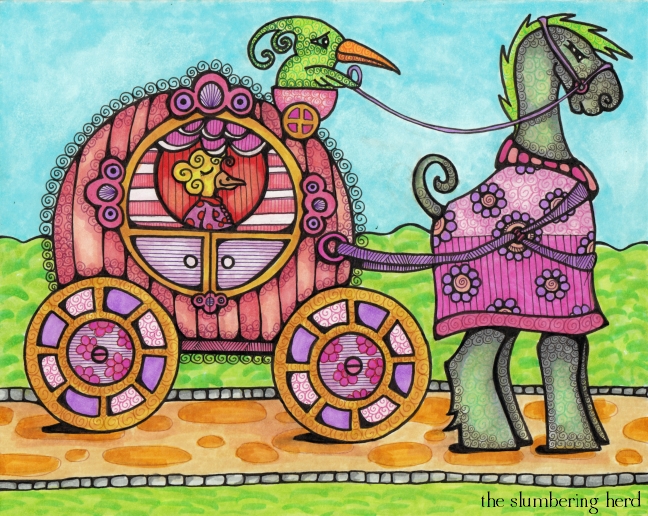
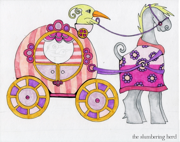
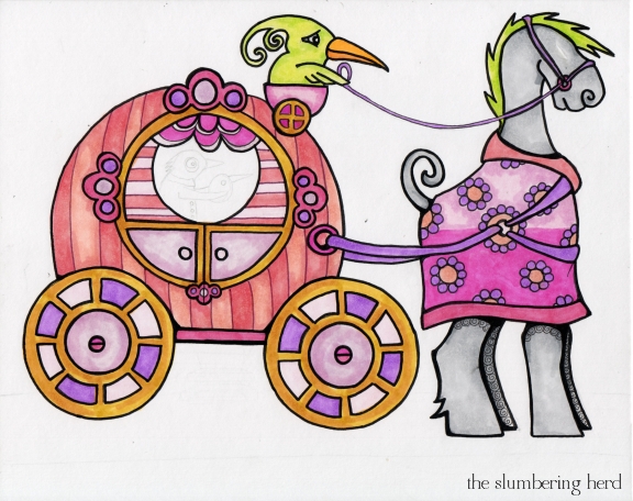
So this carriage illustration is not my favorite thing I have done. In the first place, can you see the worried expression on the poor driver? He’s waiting for his brother to return with a harness that fits. I mean really, if the poor courser took a step his back ankles would smack the wheels. He’s not even standing in front of the carriage, but off to the side. Also, I need to look into ways to make ground shadows that are not as terrible as these! And now, (dramatic interlude)… progress pics!
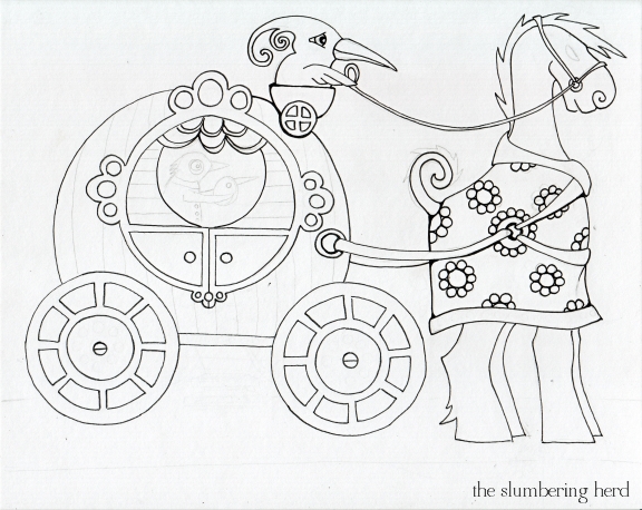
I’ll be honest. I almost started over right here. Lots of “round” but not much life! The horse beast’s body is actually quite round but it looked goofy so I covered it with a decorative coat! (With the added benefit of no chafing! Also the coat ended up being one of my favorite parts.) But even when I don’t love a sketch, I want to see if I can make something out of it.
Now that I look at it, I think the back wheel should be the one further set from the carriage. Ah, I should have looked up carriage fabrication. Alas! I fear the background is rather uninteresting, but I was afraid trees or buildings would make it too busy. Must work on these things!
Thanks for stopping in!


Beautiful image. I enjoy watching how you progress. Thanks for sharing and your generosity.
I love all the decoration you include in your work. I’m going to have to check out those markers.And thanks for the very creative suggestion you left on my piece. I hadn’t thought of Willy Wonka candy.
I love seeing the progression and reading your self critiques, although, like in your comment on my blog, I think very few people would notice these imperfections. Your animals are so charming!!!
I love seeing your animals and the thought process behind them!
Nice display of process. I like your colors and textures! Nice.
Hi Cindy! Nice to see the process, step by step. And I like very much the warried driver, the ground shadows and your dramatic interludes : ) And your critical but positive spirit too!
I like the different expressions from the characters
Sometimes you’ve just got to ignore practicalities and realities like whether or not the horse would kick the wheel. This is a charming illustration. I like seeing the WIPs too.
To give an opinion about marker art from your last post, I think the main problem with the medium is that it isn’t as archival as paint, but I love the colors you get from them.
I think you’re right. We’re our own worst critics. Still, once you see a flaw it’s hard to unsee it!
I love seeing your progress and all the details in the end. Very cool!
Thank you everyone for the nice comments!
Love the progression and the final piece!!!
Wow!You’re animal figures are really great. You’re colours are just fantastic – very cheerful! Love it. Thanks for visiting my blog.
Thank you!
Thanks for sharing. I appreciated the fact you incorporated the progress shots and commentary. I scanned/photographed the progress on my IF illustration too, but for a slightly different purpose — to model for my students, (thanks for the comments, btw, on my blog site – I like looking at the other IF entries, too, but not until after I’ve posted mine), I’ll have to include them next time I post.
Hey Cindy! Such a beautiful work and fun progress!Thank you for sharing! Great job! And thanks a lot for visiting my blog :)
What a great experimentation with getting as many round things in. Enjoyed following you in your process too.
I think it’s lovely just the way it is. One thing about Copics, once it’s colored, there’s no tweeking to speak of. That’s really a plus I think. Working in digital format, undo’s can be your undoing.
I think it’s very cute Cindy. We are our own worst critics and you are right, once we see something as flawed it is impossible to “unsee” it. I love the texture you are able to give your with the markers. animals
He he I didn’t notice the driver’s expression at first :-). The horse doesn’t seem willing to move anytime soon ! It’s nice to have such a backstory about your drawings.
Well Cindy, I think your illustration is great, again! I really like your honesty about your process, it’s great!
Speaking of illustration friday: I mentioned you in my blogpost today, because I finally made a drawing of the teetering birthday cake you suggested! If you want to have a look, go here: http://koosjekoene.blogspot.com/2011/11/follow-up-scary.html
Thank you! It’s a great teetering cake and I do think on one’s birthday, one should get at least 4 layers. ;)
I love the swirly detail around the carriage. And the cat with your space age head gear from the last post is pretty darn cool.
I just love the beautiful world you create! Copic markers are lots of fun to work with. You use them so well. I especially like the carriage with the cool little curly cue details around it.
Hi Cindy – you say once you see a flaw you can’t unsee it. I unsee a few if I put an image away for a week or so. Does that help for you?
Whichever the case, this is another great image. I think the scared driver contrasts in a good way with the contented countess !!
I think this is wonderful – bright, cheerful and clever!
I’m with you, not in a rush to post on IF, but always keen to see as much of what others have done, bandwidth loading and patience permitting.
I’d comment more on the illustrations that I have something to say about but often can’t as I don’t want to use the available sign in options such as Facebook or Google.
The thumbnails are very important, it’s the thumbnails that inspire me to visit and view an illustration.
I see your agony in the development. After my pencil drawings and re-drawings using a lightbox I move to working digitally. Then if I need to I can slice up and resize bits of my illustration to tweak it. I sometimes even draw it in separate bits and only in the digital version is it complete. I colour in with a limited palette that has developed over time. I use Photoshop but intend to move to Painter.
The one on the left is most like me (older than when I started drinking and not Asian).
I agree! Sometimes I want to comment but 1. I can’t figure out how/where to comment, or 2. I don’t want to join another service. I did finally join Flickr because there have been some really cool Flickr ones!
I hope it didn’t sound totally rude about people visiting other people. I don’t think people should be absolutely crazy like me and visit so many, but I do think it’s nice if you post something for others to see, that you visit a couple others to see theirs, too. Of course people visiting here aren’t those people. ;)
I do sometimes tweak a few lines or add a background digitally, but I prefer (for now anyway) the hand drawn product, even with some flaws. Particularly this week when I had to draw circles, I did trace some round objects in pencil, but the pen is all by hand. Which is why some are not *exactly* round. But in photoshop they would be a bit *too* round for my own aesthetic.
Thanks to everyone again for all the nice comments. It’s the greatest thing!
That’s a lovely drawing! :)
Interesting post and charming drawing! I agree: it took me awhile, when I began posting on IF, to realize that commenting invites comments. It’s a lovely two-way street. I used to visit almost every entry (except when I’m on my iPad which doesn’t like Flickr when I use the link viewer) but now I hit (1) my list of “regulars”, (2) everyone who visits me and then (3) as many others as I can. It’s so rewarding, isn’t it?
Rewarding, exactly!
I think you are being too picky :) No body else would even think of it as your pattern is just so amazing! Thank you for showing us some of your process :)
This is great! I love the quirk in your illustrations and your colour palette is distinctly you. Your steampunk work is great also….. Keep going and stop being so hard on yourself :)
I like it Cindy! You’re too hard on yourself (I know I’ve said that before…).
This is cool! I love that you’ve conjured up a whole world here. And the progress pics are fun too- I’m impressed that they don’t look like a giant mess, which is certainly how mine would look!
This is a graet idea for round :) the horse is my favourite part I love the design :D
Pingback: Copic Marker Illustration with Progress Pics | The Slumbering Herd