“Capable” for Illustration Friday this week, where 104 entries have already been posted.
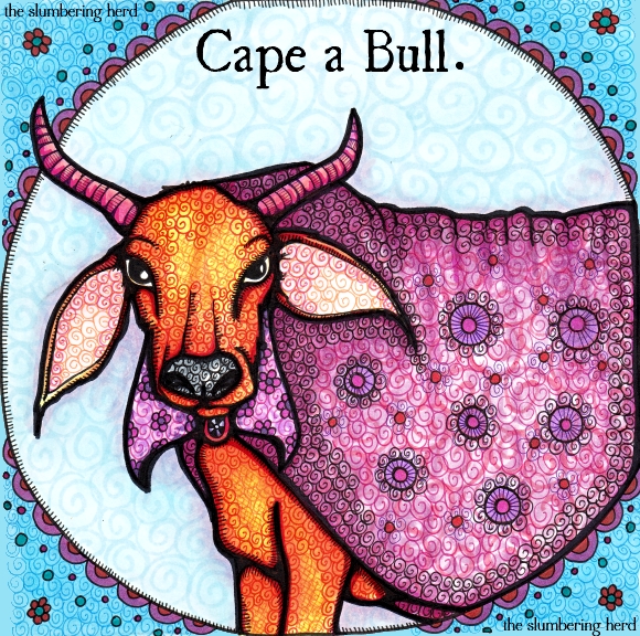
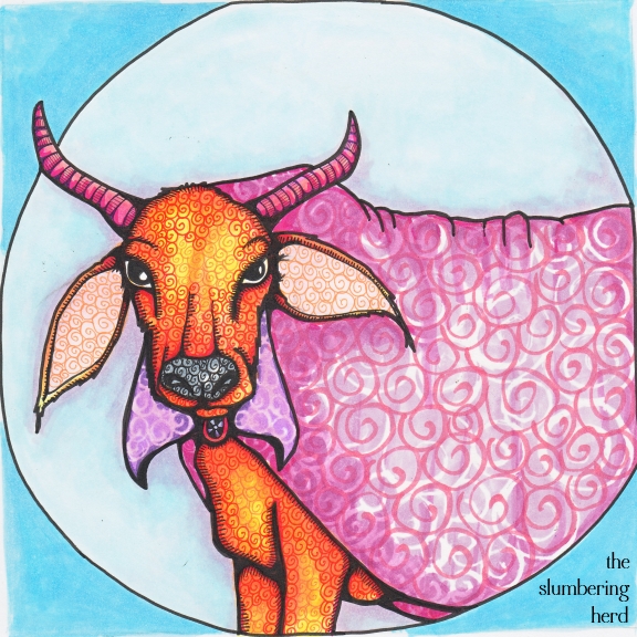
Yes, this entry is quite silly. I saw some other folks had gone with the cape concept, so I had to crank it up a notch! I think (again) this one is overly busy. Arggh! What I’ve been aiming for is ‘neat and intricate’, but where I have been landing is ‘overworked and confused’. But I’ll keep trying.
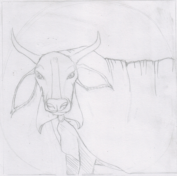
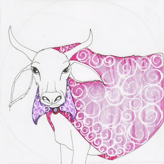
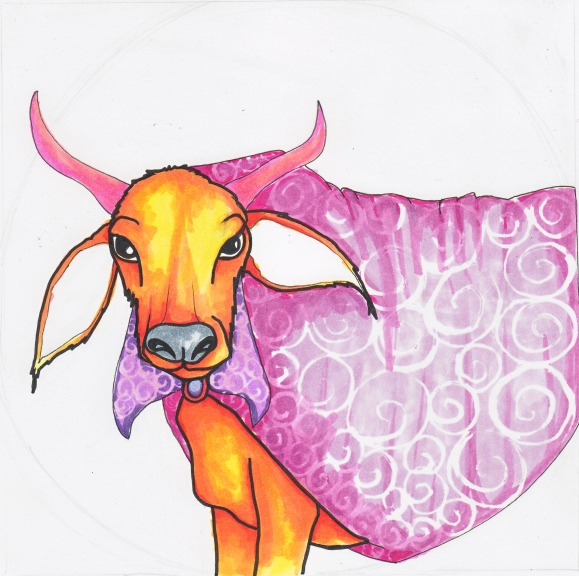
Here’s how it happened:
A decent effort but definitely overworked. And I don’t love this color combination quite as much as I’d hoped. Next time I’d go with browns instead of blues. I’m often worried that browns are too subdued but 1. sometimes subdued is good, and 2. I really do have a lot of different browns and I generally like it when I go that way. And so ends today’s ramble!
The font is Ugly Qua. Thank you for your visit!

This is hilarious and I truly like the colors and the patterns. And it is so interesting to see your process. Mind if I ask what kind of paper you use? Whenever I use my Copic Ciao markers they bleed out and I have those streaks. And how long does it take you to do such a picture?
Thank you for stopping by and your nice comment on my capable Muffin Paper.
Enjoy your weekend.
Hello! The paper I am using is Canson Comic and Manga Drawing Pad, a smooth 150 lb. paper (it’s not perfect, the markers can feather a bit). I was using Bee Company Artist Marker pad but at 110 lb. the liquid frisket I have been experimenting with buckles the paper. Streaks are almost a given with markers, but I find that using a circular motion when filling large areas, along with adding several layers, helps reduce streaks. This bull probably took about 5 hours, at a guess. Thank you for stopping in and leaving a nice comment!
I love the wordplay and matching illustration. Very fun and funny. I like seeing the process too. I understand what you mean about colors and feeling like it’s overworked, but this piece doesn’t looked overworked at all to me and I like the colors here. It’s beautiful!
I disagree! I don’t think it looks overworked. It looks interestingly detailed. I love the contrast of the bull’s orange-brown color against the fushia cape. Also the look in his eyes, like “Are you kidding me w/ this cape? Do you know I’m a bull?” The circle background is a nice touch that really makes the bull the center of attention and makes him pop.
You have such a lovely style and the vivid colors are striking~ Really wonderful :)
I like your take on this weeks theme it took me a minute to make the connection of the Cape I thought it was his name at first. Cool new animal character.
Thanks for your comments on my work! Decided to check out your site, and WOW…these are beautiful! I have used copic markers, but hated them – clearly I must have been using them wrong. I should try again sometime. I actually like the color combination, perhaps a rust brown background would have made you like your color scheme more. I love the pattern on the cloth, a less-busy pattern on the ox might make it feel less “over-worked.” Although, honestly, I thought it was lovely.
Thanks so much for your kind comment on my blog. I love this guy! And I think the color combo is quite nice; though, after perusing your work a bit (LOVE it) and seeing your more monochromatic and neutral-toned work, I understand why this might feel like a bit much. Still fantastic! I adore the detail and line work!
I love this painting! Actually, when I first went to this page, I thought it was a mistake, because this looked like a published book cover to me. Very beautiful and unique style.
Beautiful! love the detail and expression.
I lie your cape bull. High quality work as always.
This is gorgeous and a great pun.
Beautiful work Cindy!I love the step by step coloring process!Thank you for sharing! :)
LOL, good idea! I like the cape the most but I also like the whole effect of the repeated pattern :-)
This is great! I LOVE all the patterns! you are SO patient – not overdone at all! Sorry I was dense at first about the cape thing – very clever!
Love the play on the theme – I never even thought of cape-able! And great detailed pattern on the bull and cape – amazing!
Wow. This is amazing! It took me a second to get the play on words – very clever. I love the detail and thank you for showing and explaining your process. I am very new to markers and find them extremely difficult to work with.
Thanks so much for all the great comments! It’s so encouraging. ;D
I adore this idea!
Oww My GOD!!! It’s really amazing!!!
Great take on the word Cindy…Nice work..I like this bull…I think it’s a pity a few more people didn’t put a cape over bulls to comfort them rather than wave it in front of them.
I think it’s neat and intricate, and beautiful. Great job!
Fantastic work! Very well “worked.” Great take on Capable theme!
I don’t think this is overworked at all! Love it! You had me with the title.. Really wonderful!
Very clever!! I love it!! :)
Not silly!…extremely clever play on words! I do love your bull, colors and patterns. Great illustration.
I love the play on words you used there, very funny :D I really love your work with markers, being a marker novice myself I rather envy you :) Nice work!
Love it! Really nice work with the markers. I actually also love the second version when the bull is white and the cape is pink =)
So nice that you share your process!
Hahahaha! Nice play on words and I do like your choice of colours and the lovely swirls to texture the bull. Awesome as always!
This one is fantastically amazing! (descriptive words are bit slow this morning…) Love how he is looking at me as if to say “What the hell has she put on my back?!” He was probably OK with it until you added the flowers… Love it, LOVE IT, LOVE IT! (imagine the last LOVE IT in bold…)!!
Haha, thank you. You’re right he is exasperated, but he is also very patient, and he is used to it. You see, he was once a popular model for the magazine “Bully for Fashion”, (tragically discontinued about 1993).
Clever!! Not only that, but it’s a beautiful illustration. That’s a very capable cape!
Nicely done Illustration Friday piece. You put so much work into it!
I think it’s great you show the whole process.
It’s very funny and I love the details :)
cool pun, colourful bull!
Your work is amazing!I love colors and animals!Great! :)
lol…love the play on words!
I think he’s a smartly dressed fellow, wouldn’t change a thing. The colors, patterns and details are vivid and well balanced in my humble (and amateur) opinion.
Perhaps the start of an animal-based Zodiac series sometime down the road? Maybe use a Virgin Queen Bee for Virgo, a snake (for scales) for Libra, twin Panda cubs for Gemini…?
Many thanks for taking the time to document the steps and details! :)
nice play on words, my family had suggested someone with a cape, but the bull is perfect. I liked seeing your process, the expression of the bull is great.
The cape is beautiful. It will surely be the latest fashion trend in cow coats. Leather is so yesterday!
I don’t think it’s overworked at all. I love the patterns and colors. I enjoy seeing your process in the WIP shots too.
Thanks for visiting my blog again – would you be interested in joining a Moleskine Exchange (you buy a Moleskine sketchbook and then the group sends the books to each other, adding art to a few pages every time you get a book). Once the books are full you send them back to their original starters. I think your style would be awesome in an exchange. Let me know if you would want to do it. If you have Flickr I started a discussion there too: http://www.flickr.com/groups/moly_x/discuss/72157629466910229/ I hope you are interested!
Hahahaha! Great interpretation. You are a clever girl :)
Cindy, this is great. Reminds me of Ferdinand the Bull, one of my favorite stories. The only reason you beat me to the “cape” punch (or should I say pun) is because of all the work you put into your illustrations, my doodles only take a couple of seconds.
oops should have said, I beat you, need more coffee.
Love the vivid colors & the fun patterns, in combination with the bold black lines. Especially like the highlights in the bull. Not overworked at all in my opinion. Really consistent with your unique style! Love it!!
He certainly is! And he’s stylin’ hard with that get up.
On another note, it’s way too complicated leaving comments here. I had to complete 4 required fields.
I’m exhausted :)
This is fantastic, Cindy. You always do such fantastic work but I must say that I’m super impressed with this one. I agree that it doesn’t look overworked to me at all. The colors and swirly texture are (as usual) fabulous!
Cindy – I’d like to add my compliments to the work, Really lovely. I enjoyed the process pics as well..and looking through many of your other posts. Gorgeous patterns, “characters”, and colors! Great work!
Cindy, I’m back, I didn’t get lost in the wilderness! Love this very regal looking bull with his fab cape (is he SuperBull??) After two weeks of no internet, I am ploughing through 222 junk emails and about 350 real ones, so heaven knows when I’ll post some artwork – soon, I hope! Someone came into the gallery and told me about this superb white smooth synthetic paper recently. It’s sort of plastic and non absorbent and is called YUPO or something like that. She was going to leave me a sample so I can test it with ink. It might be good for markers too.
Good to hear from you, Gay! Eek, your email box sounds dreadful. (But maybe better that way than empty!) Thanks for the tip, I will look into it!
This looks great and not overworked at all! And I like the color combination too. Great to see the transformation to the finished product!
love the pun…it made me smile….and love the textures you build
Wow, so many awesome comments. Thank you to everyone! In a few cases folks don’t leave their web address so I can’t visit back, but otherwise I try to visit everyone. It makes such a great community!
And apologies about my complicated comment verification process. I picked a WordPress option that had a lot of good feedback, and it has worked 100% (no spam), but I would like my place to be user friendly so I will see if I can find another option.
Holy cow! Er, I mean bull. Judging by the overwhelming response you’ve received for this post, I’d say you have a big hit on your hands! It’s PERFECT as is, Cindy. I think the ‘overworked’ (as you put it) works perfectly well with this word. Carry on!
Another great beast! Love your work!
Looks like the bull won the fight, and kept the cape as a memento.
A very capable bull.
not sure I want to see what the bull fighter looks like now…
.
Cape a bull!! I love all of the textures, and I think blue background is lovely. I also very fond of his serious face. :)
The cape looks like velvet. This is not overworked – it is just right.
Thank you for the nice comments on my blog. Sigmund thanks you too.
As always I like your illustration very much. Thanks to you I use my Copic Markers again!!
That’s great, and thank you!
Thanks for your comment on my blog, Cindy. Clever play on words! And a LOT of work was put into this illustration! I struggle with picking colors, too. I think it looks good. It’s hard to see things when we hover over our own pieces as long as we do.
Ahahahaha! I’m a sucker for a pun. This fellow actually does look capable of doing some serious damage, as well… I wouldn’t write him off just because he likes to dress up in pink!
One of my favorites!
Haha! Really, thanks so much to everyone!
Truly clever and not overworked, I don’t think-just right.
Oh this is fantastic!
I don’t think it’s overworked at all. Somehow, it just all comes together. Love the color combos and the rendering of the figure. Those swirling patterns are lovely.
So fun! I always love your work!
AMAZING :D
Ha, great idea. Really funny take on the topic. Once again, nice illustration.
Haha! you are so clever. And this is beautiful as always :)
This is really wonderful, Cindy! I don’t know how I missed this post, but I was looking at the Horse n’ Hound artwork, thinking that they looked like very “capable” leaders of the table tennis club. Then I saw the link for previous post. He he That’s how I got here. I love the play on words and your beautiful Cape A Bull. :)
I am indeed impressed with the number of comments people have left for you! But I can see why. Love your rich, vibrant color palette and subject matter. Very inviting.
Good stuff! Like how you’ve shown the process in creating it.
Your work is amazing! Love the use of colors and the details in the design.
A fetching cape indeed. Everyone should have one.
I really like the way you show the process. Wonderful piece!
Thanks for visiting!
I think your work is fantastic. I really like the texture and graphic elements you incorporate. And, I dig that you show your process.
Thanks for sharing!
HAHAHAHA! Oh, I LOVE it! And overworked? Noooooooo. It’s gorgeous. Looks like jewelry. No really. The oranges and pinks, and the way you have shaded it just perfectly….looks like gems!