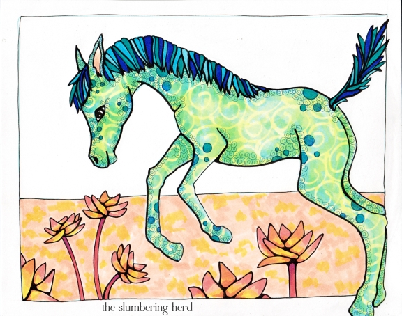
For a day and a half I was stumped over Jump, the Illustration Friday topic for this week. Things I considered: kangaroo, jerboa, jackrabbit, dog with frisbee, cavorting goat/colt/donkey/alpaca, leaping cat or bighorn sheep, lemmings jumping onto a bouncy castle. Jump starting an airship. Though I am posting this pony, I do not consider it a successful execution of the IF topic.
So why post it? Did I learn some things that might be useful to someone else? I hope so! And I will also say I don’t think it’s all bad, sort of a pony and pattern study. I like the flowers. I am going to post just a few progress pics and talk a bit about where I think I went wrong.
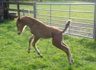
This is the extremely adorable photo I finally settled on. It comes from Northern New Forest Ponies of Western Yorkshire. I didn’t have much of a plan beyond drawing him. I thought I would figure out what he was jumping over later. This was a mistake!
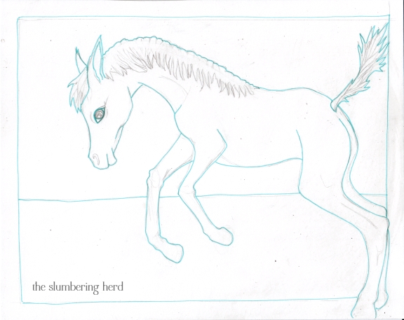
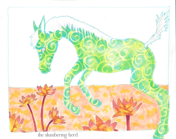
So here he is, cute enough, but not very interesting for an illustration. I was already inking before I decided what would go in the background (or the foreground, for that matter). And the horizon line was a mistake to include without knowing what else would be added.
I think the lesson of this enterprise is that one cannot expect wonderful things all the time if one does not plan ahead, and for me that means the sketching stage. Sure, sometimes things go GREAT with very little planning, but I suggest this is the exception rather than the rule.
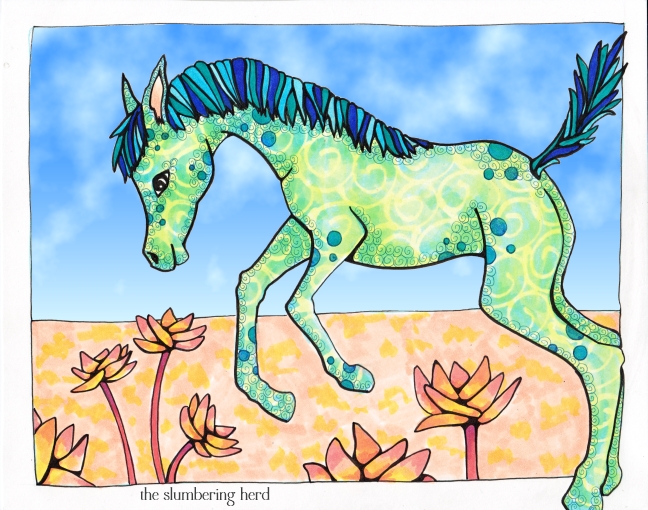
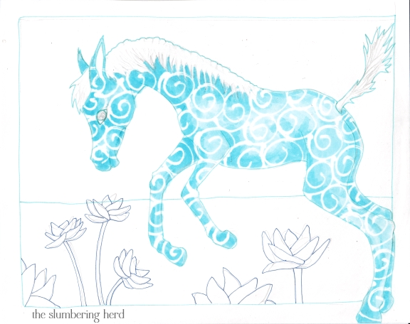
Flowers were added, but they look a bit like an afterthought because well, they were a bit of an afterthought.
Should have left him blue. Arrgh!
I went with a digital sky this time because I didn’t want to spend any more time on it. I may yet add a Copic sky if I put the original in my Etsy shop, otherwise I will move on to the next thing.
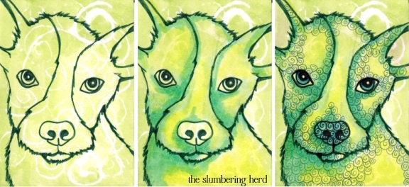
And speaking of the next thing, and because I thought I should add a successful enterprise along with this unsuccessful IF entry, here is a green puppy ACEO (2.5″ x 3.5″ art card), that I also did this week. I must admit I think he is terribly cute. And I think that is a good way to end this post!
Thank you for stopping by! And thanks to everyone for their super nice comments lately, I really appreciate every one!

Planning is a very important part as you said, but your pony is still sweet.
Love the puppy dog!
Wow, I don’t think this is a misfire at all! You put a lot of thought and energy into this, with many wonderful results!
Love the pup aceo- almost looks like one of my pals, only a pup of a different color! ;o)
Very happy shot! :)) i like the colors and movement.
Love the texture!He’s so cute:)
Very cute, and appropriate for spring! (even though you don’t like it…)
I so know what you mean about starting with e/g figgered out from the start on the sketch. But s/times it’s just fun to go w/ the flow and see what comes. What I like about the colt is that he has a playful attitude that quite obviously illustrated. I also like the color choices on him – I do like the green especially paired with the blue.
That’s one sweeet puppy!
what a lovely post with the jumping colt!
i like the colors so together, very lively.
and the doggie really looks adorable!
Wow, I love your style! Super cool patterns and colors. I’m not familiar with Copic markers, what an interesting medium. You get amazing results!!
And that Green Puppy is wonderful!!
Your pony has springtime in his step. Drawing horses are not easy getting the legs right. Thank-you for showing the error drawing. It helps to show that lots of work goes into an image. A few we do not like but they support us onward to ones we do in finished drawings.
Glad your brave enough to post these learnings. I like them too.
Aw I still like your pony even if you think it’s a misfire. I also like the green and blue coloring – so pretty with the yellow swirls!
Hi Cindy,
I really like your composition. It looks as if he’s jumping into the field of flowers. He is so creative and full of the joy of spring.
I love the jumping horse. He’s so beautiful I think he must of run away from a merry-go-round.
Thanks for sharing your process!
Breaking the border was a great idea!
We artists are quite hard on ourselves, I know. : ) I think it turned out well. It’s hard coming up with ideas for even the simplest of IF prompts!
I love the pony! Especially the detail translating as shadows and the seemingly random (yet I am sure well planned) polka dots. The background does not bother me one bit, for your focal point so well done. I also like that he is not bound by the border – jumps right out if it, or into it, whatever the case may be:-)
I like the pony a lot actually. I think to me he looks more like he is rearing rather than jumping but if I didn’t know what the prompt was I would have thought it was a just a great piece, totally worthy of appearing in the shop. I love the green with blue dots coat. And the dog is just super cute and the fur came out REALLY well.
Thank you for all the kind comments! You guys are the best!
Actually, some of my best work is due to afterthought parts… So I wouldn’t discount those latter day inspirations…
—but I do find I’m more pleased with composition with a passel of thumbnails to explore with before the final performance.
Your color choices set a nice mood to the overall.
.
This pony is adorable and you executed it very well!! I was so totally stumped by jump that I didn’t participate this time.
I forgot to tell you… the puppy is really cute, too!
I think it’s pretty darn cute Cindy. I, too, posted a jumping horse I wasn’t totally pleased with, but as you say, I didn’t think it was ALL bad and I posted mine because I think of my blog as a diary and journey. Maybe one day I’ll revisit and improve upon it. (Or cringe in horror!) ha.
Well Cindy…I think its a good hit…ponies jump about a lot…and the flowers are a good after thought balancing the composition well.
Really love the colors & pattern in your frolicking foal! The greens, teals & yellows are so pretty together! And the pup is a cutie!
adorable jumping pony!
Thank you for your sweet comment ^^
Wow, I love your textures! What an interesting technique and a great way to use copics. I haven’t used mine for ages. but now I want to get the dust of them right away.
Enjoyed your process – the mental as well as the visual. Pony joy of jumping is one thing, and a composition that sings, has meaning beyond the surface, well, we wouldn’t hone our skills if we were too easily satisfied. The layering is not immediately discernible, but its effects sure are. Lovely post.
very nice love the colors
Aw, I think he’s adorable.
I like the blue/green/yellow combo.
Sometimes things don’t turn out the way we like, sometimes “happy accidents” happen and sometimes we surprise ourselves.
Plan a little but allow yourself to see where you’re going as you’re going – like you usually do with your coloring.
Super cute puppy :)
Cindy, this is a cut little pony but I totally understand your lesson here. The past few weeks I have been severely fresh out of ideas for things to draw with the most recent Illustration Friday themes. So I’ve decided that instead of stressing over it to simply not do it if I don’t feel inspired. I know I won’t like the end result if I try to force it. Instead I take the time to let my imagination refresh itself as I patiently wait for a theme that strikes a cord.
Soooo cute…
Love your colors and the break down of your process. Thanks for showing this. I tried to leave a comment yesterday, but for some reason it wouldn’t let me do it.
Hehehehehe, he’s adorable! He has such a look of glee on his face. It’s infectious. And I love the color combination! If you had kept him blue, he would have blended into the sky, no? :)
Ooooooh, puppy dog makes my heart melt!
My first thought, before reading your post: What a perfect pony – love the green! The green makes him fresh and Spring-like. Great legs and hooves. That puppy looks quite mischievous,like he’s ready to open his mouth and go, “Ruff!”. Thanks for sharing your process thoughts.