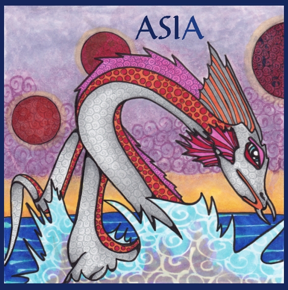
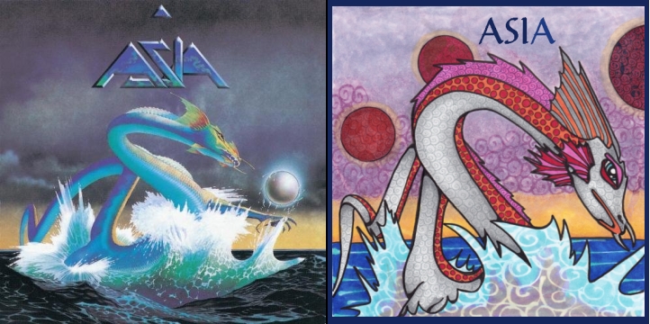
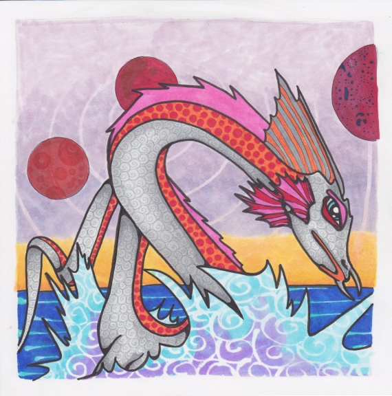
It’s Re-Imagined Album Covers over at Monday Artday. My first thought was artist Roger Dean, because I like his strange creatures and alien landscapes, and I knew he’d done a boatload of album covers. I settled on this, Asia’s self-titled debut album, so I could do my first sea serpent. Thank you, Roger Dean!
I stopped short of a handmade font because I haven’t done many and I didn’t want to muck it up. I could have done it on a separate sheet but I felt like I’d taken this project as far as I was going to take it. The frame and font (Carmenta) were added digitally.
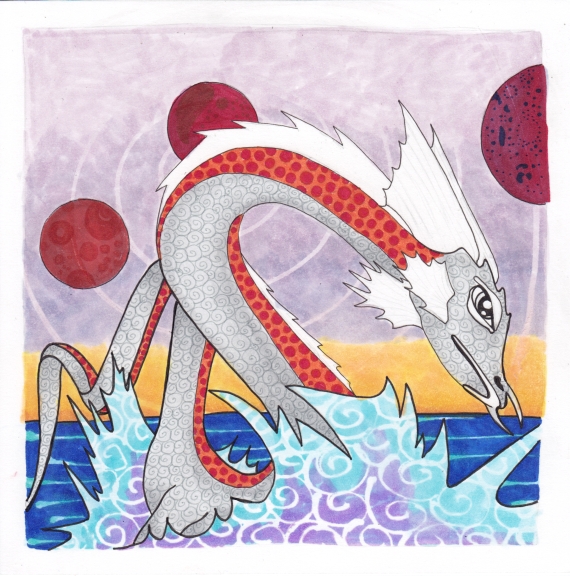
His name is Horace. If you want to know why he looks mildly irritated, it’s because the damn sea urchins get all camouflaged against the sea floor, and tickle poor Horace as he swims past. This usually causes him to shoot straight up out of the water and amuses the urchins very much. By the time he hits the top of the water he is no longer surprised, merely annoyed about forgetting to avoid the sea urchin bed again. I can’t give you any information about Roger Dean’s serpent, however. That one is a mystery.
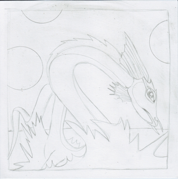
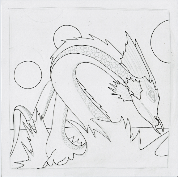
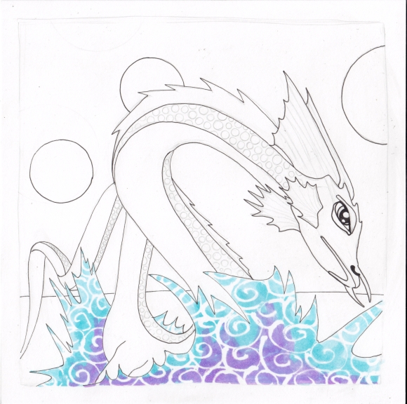
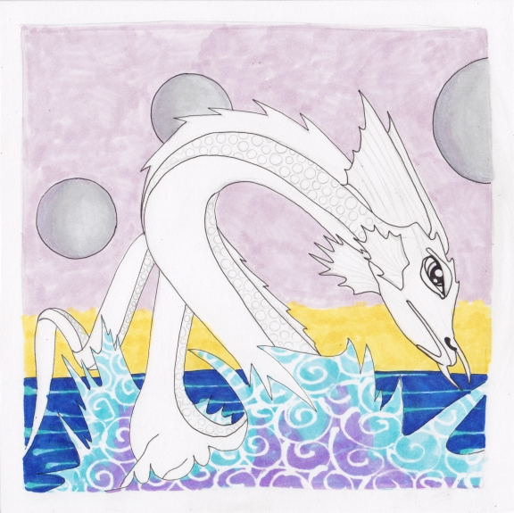
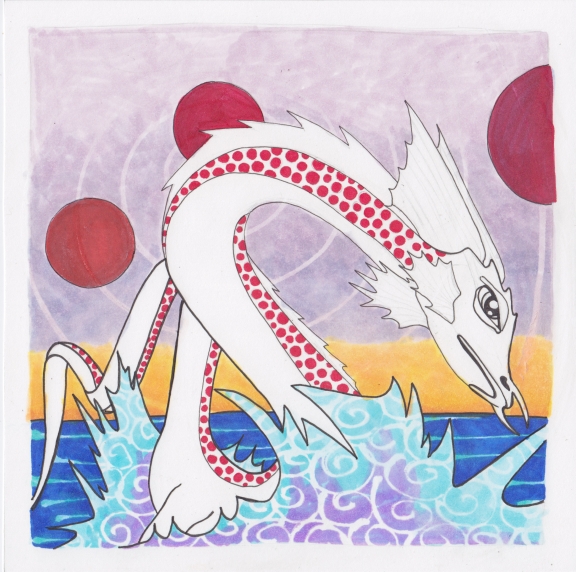
And here’s how it went:
I was really worried about the colors at this point. Too many colors! And the red planet idea was not so good. But it worked out.
I wasn’t quite happy with the sky, or the planets, but decided to put down the pens at this point. I am pretty happy with doing something a bit outside my usual style. Not a ton outside, but a little. Thank you for visiting!

Wow! You have a flair for this sort of stuff – so much better than the original cover (sorry Roger). I actually really like the sky and the planets, especially the planets! Well done…
Thanks for the blast from the past. One cannot get enough sea serpents, I always say. I agree with Karen – I like the sky and planets. I also really like your graphic sea splash.
Wow great job on this one! Love the colors and patterns/texture. I agree with Karen and Kim and really like your sky and planets in the background.
Wow, I think this is even better than the original. He is so dazzling in his patterns and stripes. And the colors! Thank you, sea urchins, for making him jump up so we can see him in all his glory!
He’s beautiful! I’m with you on the mid-point when the colors don’t seem to be working. I run into the same. It always amazes me how it works out, as it did (once again) here. I especially like the flowing nature of your lines on this fellow.
I am so impressed with your work. I constantly enjoy spending time on your blog. Your work is inspiring!
Hugs,
Marie XX
Thank you so much for all the really great comments! I was pretty happy with Horace. :)
I LIKE it!!
I’m finally back on the pc and can comment. Love the dragon! Horace seems much more approachable than Roger’s, but not quite Puff-like.
Tickling sea urchins! ha ha ha I love this one!!
Love the outcome – and version 5 as well! They are both beautiful!
Not sure if my last comment registered (I always screw them up for some reason) but I love this style. Is it all hand done with watercolor or is there some digital work?
Hello! No watercolor, just Copic pens and markers. The only digital bits are the frame and text. And I used a masquepen for the swirls in the water. Thanks for asking!