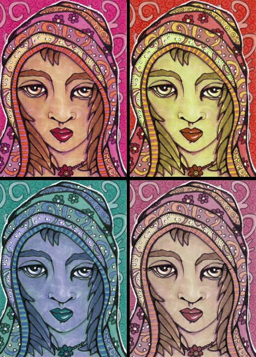
Leah the Mystic is another denizen of the Many Wonders Woods. Nobody is quite sure where she lives or what she knows, but if you happen to see her wandering the shadowed pathways, follow along for a little while. She might tell you a secret. She is also Maiden Number 20.
For “Identical” at Illustration Friday. The original is the image in the top left, and the rest were created in paint.NET using the hue and saturation sliders. I used a lot of different colors which make the changes more distinct.
I know opinions may be mixed but it does feel like cheating, and perhaps for IF it is a bit! Completely changing the colors with the touch of a button. And it turns out, despite my love of bright colors, it is the lower saturation settings (the bottom right) that I like a bit more than the original. So, I need to figure out how to achieve those subtler colors, which remind me of an Art Nouveau palette.
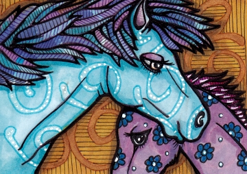
Leah is also a friend to the Blue Horses. Born lavender, the Blue Horses turn blue by the time they are two. The lavender helps them blend with the purple undergrowth in the Wonder Woods, and the blue helps camouflage the adults among the Blue Willows.
[portfolio_slideshow size=large]


I always find it interesting how the same drawing can change personalities by simply altering the color scheme. number 3 is my favorite.
I also like the quiet texture on her face(s)
.
Well, isn’t that interesting that you would prefer the de-saturated version the best, since you are so nutty for color. I kinda like the yellow green one the best. I think it’s because she looks the most like an alien in that version. She also looks a little like Uma Thurman, too.
But isn’t photoshop the bomb? It’s so forgiving, unlike the old way of creating art. And I’ve always said that working in PS reminds me of playing with my very first etch-a-sketch on Christmas morning when I was 10 years old. But I still create all my art traditionally, and ask the artists who work for me to do the same. I then scan the art and do all the tweaks and revisions in PS which has become my favorite part of the art process (I think it appeals to the perfectionist in me).
Figures you’d like an alien look! She does look a bit like Uma Thurman! I didn’t really have a photo reference because although I looked at a few faces to try to get the lips right (still a struggle!) mostly I winged it.
Hey, why dont you post a link on your page that explains how to make an avatar here. A lot of us are from Blogger, and we look awfully bland when we post comments here. I think I tried to figure it out awhile back but couldn’t find an answer.
Great idea. Um. I’m not sure how to do that (clearly, since I don’t have an avatar in my own comments) but I will look into it!
Hi Cindy, no such thing as cheating when you work the way you do. I agree the original is my favourite. It is interesting how the images are identical but the change in colours makes them look completely different.
Not cheating at all, simply illustration. All the colors work for me. Also love the movement in the horse’s manes.VEry good!
Hi Cindy, I think they all look great, obviously, each artist has in his mind the color, saturation and tone, which he thinks seems best, but the observer does not know it and what he sees is fine
I think you could be a very good designer of printed fabric, this would look great printed on silk, for example! Congratulations!
You must have had a magical childhood, because you still have a very vivid imagination…. which most adults seem to have lost. I love these very much! Your details are so fun!!
Well, first off, you know I like her name! ;-)
The color variations are fascinating. Oddly, as much as I work in PS I’ve rarely done overall colorway changes for an image, usually just corrective tweaks. This four-season effect is very appealing & seems especially suitable for a woodland being!
I like the first & last ones….I think the warmer tones appeal to me. And yes! I immediately thought Uma when I saw her! The horses are great! Love the vivid colors!
I like leah’s blue period!
A lovely range of Mystics. she’s beautiful.
I really like the illustration of the Horses. Sensitively rendered and a wonderful story.
I like the bright colours in your original image best but I like how the different saturation changes the character of Leah.
Definitely the likeness of Urma Thurman…..interesting effects w the saturation. I like the top right image best….altho there is a subtle transparency with the bottom two.
Hi Cindy, I did not go around so much lately, but I did take a look at your blog everytime, just did not leave a note.
It is very lovely all of your work!!
I enjoy your blog!
Leah is beautiful and definitely mystical. Love her soulful eyes.
I love your horses.
Aww I love all of the different versions, but the first is probably still my favourite, but then I like lots of colour too :) I think it is fine to go digital in illustrations, it can open up so many different avenues. I only really use photoshop for tweaking at the minute, as I’m trying to improve my old school skills, after studying graphic design, I came to rely on the ‘undo’ command and found things like painting really hard to go back to because of the fear of going wrong- silly huh! I love how you incorporated the spirals into the fabric – gorgeous! :)
WOW!! & Love the Horses!! Mom
My favorite is the last one too. I think the subtle colours are perfect for this lady,they make her look more mysterious.
Your horses are beautiful ♥
It’s not cheating, it’s using a tool that’s available to do color experiments! I haven’t done much playing with those sliders. It’s amazing how different the colors can be. I think the 4 look great together as one piece!
I love the intricate patterns you use! Such gorgeous colors, too :)