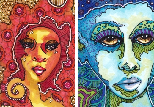
Recently someone pointed out this neat exercise with intuitive faces. Although the directions are for watercolor, I figured I could try to coax a more watercolorish effect with Copic markers. So far the results have something of a hippy vibe.
For this reason I am declaring this the Power of the 1970s post, for the topic “power” at Illustration Friday. I have not abandoned the cityscapes, more of which you will undoubtedly see if you come around next time. And thank you so much to Vinyl Eraser who does terrific architectural drawings, for mentioning my 100 Cityscapes Project!
Thanks for visiting!
[portfolio_slideshow size=”large”]


Very cool! great colors!
Hi Cindy, I think your drawing for Illustration Friday ” power ” is great. I love the way you worked the colors.
I LOVE these!!! This is the kind of art I was doing in the 70’s. he he he They are super! It takes me back to a really fun time for me. :)
Really wonderful Cindy! First, you could have fooled me. These really do look like they could be watercolor. And, the first image is really something special. It vibrates!
Can’t wait for the “dance” to start….. really great design and color. Congrats.
Absolutely! The left face seems a poster from the seventies! Maybe the colors or the flowers. Great!
And thank you very much for your kind words :-)
By the way, one of the related posts point to a previous exercise on styles. Enki Bilal is one of my favorite comic artists.
Love them!!!! You work magic with your markers ♥
Wowzers! What a great pair, psychedelic and rather spiritual to me as well. They are like day & night or sun & moon spirits…. mhm…. very lovely pair indeed!
And thank you for sharing the 10 minutes ATC exercise, I will try it out for sure.
Wonderful, Cindy. My favorite is Donna Disco.
Flower power!
Peace man! I love the red one. Beautiful!!
very cool Cindy–love the kick back style of the 70’s!
I especially like Rhonda. Nice job!
These are amazing…..I LOVE the washed effects of the faces…..very different then your usual style.
Do you just add water to the pens or put washes down on paper first……to get that look? I’m curious….
No washes or water. Just lots of layers of Copics, mostly light colors, then darker on top. Then some ink. Then more colors. Then more ink and gel pen. :)
Ooooh, I like! Thanks for sharing the intuitive faces link – just what I need to get a paintbrush back in my hand:-0! What a fun excercise.
These remind me of album covers! So psychedelic!
Well sock it to me! These are outtasight! Great, fun, whimsical work. And thanks for the link to the arttrade mag which talked about the steps involved. I may just give it a go.
She’s got the power for sure! These look like they could be album covers. Amazing!
Psychadelic faces…Brilliant Cinders!!! Is this a flashback to your LSD days?
Really powerful and arresting images! I love the mix of colors, too.
I love your imagination the way I love pizza: Obscenely, and without end. I had no idea you were doing a 100 Cityscapes project, but I just peeked at the flickr, and WOW! I adore “draak eiland” and “Marla’s Tiny Village” and “The Early Ship City.” You are so good with variations on a theme!
And Rhonda Red’s lips and eyes, by the way? Me. OW.