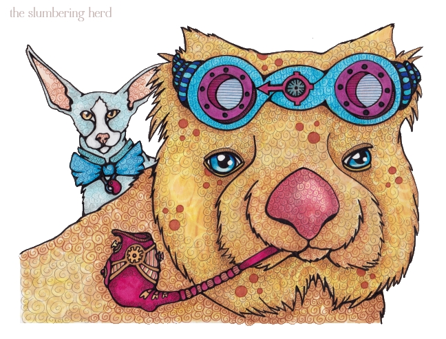
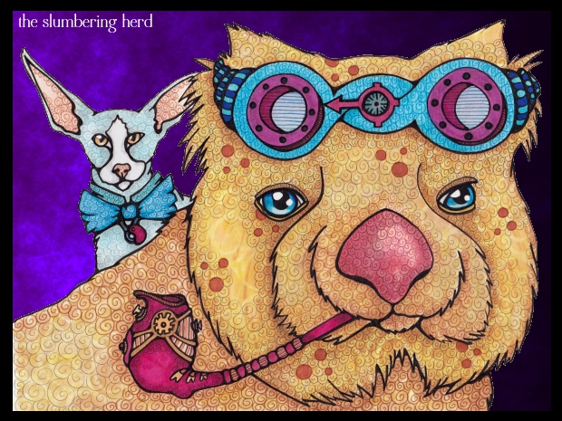
I wasn’t sure whether to call him Steampunk Wombat or Aviator Wombat. He has asked me repeatedly to simply call him Taz, his given name. (Actually, I wasn’t sure if I should even call him a wombat, since his appearance has strayed somewhat from species norms. But that’s ok.) Along with Taz today is his good friend Hastings, a reserved yet wily cat.
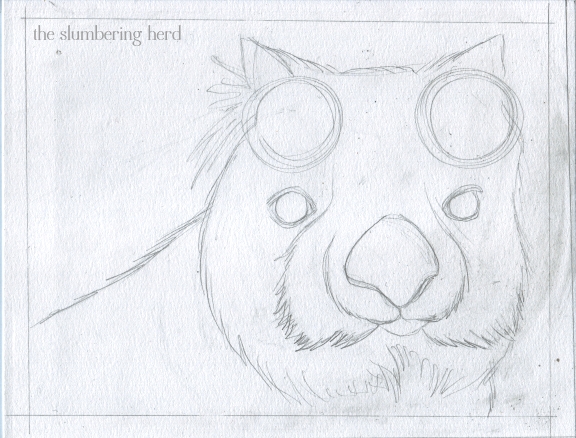
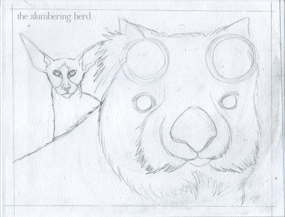
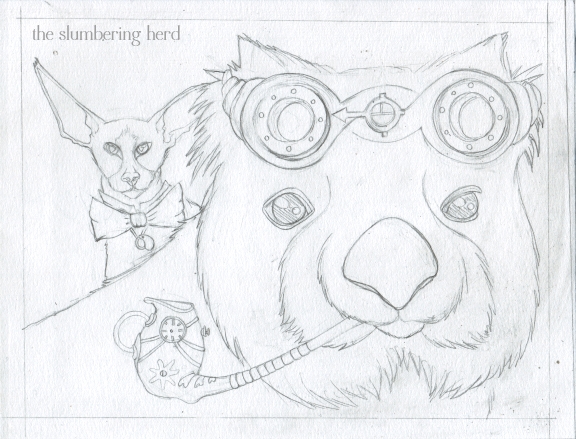
Because my last post’s piece suffered in the sketch stage, I have included some extra sketches. Here goes:
Mostly wombat shaped. Reference is an un-attributed photo on this page, which must be Australia’s version of the Franklin Mint.
A much-needed friend (adding interest to the composition, hooray!) Reference is Sir Mauri Vilendor, hailing from a Lithuanian Cattery. (Ah internet, what wonders you still hold!)
Now that’s a sketch. I decided against an ocular device obscuring one of the wombat’s eyes, and I didn’t leave enough room for a dandy-ish Victorian scarf or suit, so I went with aviator-ish goggles and a curious yet stylish pipe. Very happy with this sketch, I must say. Slowing down at the sketch phase = good. It also means the sketching takes all of one evening, leaving the rest for a subsequent evening.
Of course it also suggests that taking more days for sketching might be better still, but I must work up my patience slowly.
Recently I’ve been doing an initial ink in a color other than black. They smudge less when erasing pencil lines, for one thing! But they are also somewhat less final.
The background is white because I could not decide on a color. Probably peach or something dark. I did some digital backgrounds to test.
Leave it white? Any preference?
Oh also, new banner! Thank you so much for dropping in.

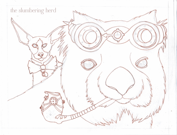


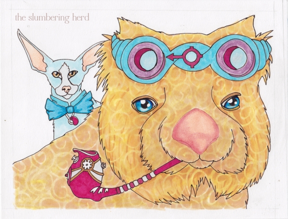
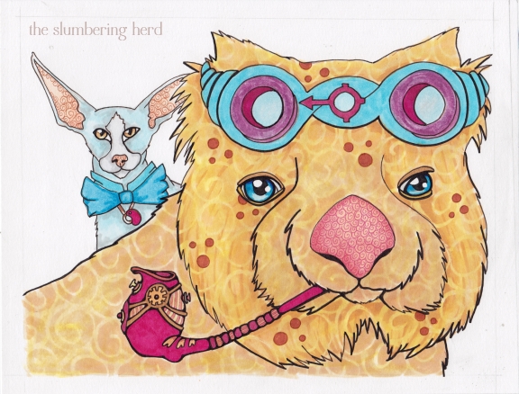
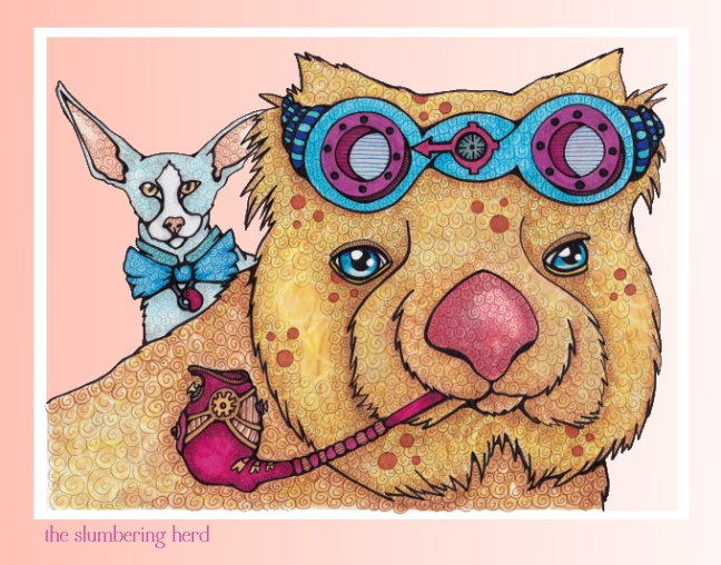
wow… when i got to the final coloured of Wombat…
the colours just came together so good right off the page good
Love the addition of the pipe and the detailing on it. I think I’d go with the darker background. . .makes the wombat pop more :)
So funny! Man, the masquepen stage really makes you look fearless. Love the cat’s big ears and the glow in the Wombat’s eyes. I like it on white.
When I do illustrations in color pencil, I often use tones of sienna for the final sketches as well as a slightly darker colors of the object itself. I think it gives it less of a cartoonish look. That being said, I have n/g against a cartoonish look! Hey, if you say that often enough it begins to sound like a country – Khartun! And of course the folks wear clothing that is distinctly Khartunish… (digressing)
Fearless hm? Why yes I am! No, seriously, it’s mostly just a solid colors over the whole area (in this case the wombat) with maybe another color or two to darken a few spots. I only have to be careful about the outside edge since the masking fluid is doing its thing holding down the swirls. :)
Hi, Cindy! I noticed your new banner yesterday and forgot to comment on it. It’s wonderful! This wombat and serious kitty art is ama-ZING! I love your attention to all the wonderful little details that make it so fun to really look at. I love that! I would love to try that.
Thank you! The more I look at the banner, the more I think the text is too blocky. Someone suggested I just do a bit of text by hand so I just might!
I enjoy your steampunk animals most of all.
A steampunk wombat — now there’s something one doesn’t see every day! :)
Thanks so much for sharing your process.
Thanks to all for the nice comments!
The first thing I noticed was the awesome pipe. I really love your steampunk designs. They are so intricate, but there is so much whimsy to them. They’re not like the old grungy steampunk looks that I’m so used to seeing.
Really nice picture. I like your steampunk wombat.Very fancy.
Cindy, the detail in this piece is AMAZING! You have the patience of a saint to create all the patterning and texture in your swirls, and its subtlety adds unity to the whole. The decorative detailing in their Steam Punk accessories is really fun to explore. Peet and Buttercup are begging to meet your critters.
I’ve have had a steam punk to do list in my mind for months. I love to see the build up to your wonderful illustrations. Totally unique. Awesome!!!!!
I love your new banner!
And this illustration is very nice!
I like the purple background. It makes the steampunk wombat and his friend comes more forward.
Now that’s a dashing duo. They deserve their own sci-fi/fantasy tv series, don’t you think? I always marvel at your patterns and the steampunk. I like the peachy background because it picks up the pinks in the nose and goggles and pipe.
Great banner! A little taste of this and that in there!
oh my… how awesome this is! I just love all the texture! You rocked this one out of the water! oh and your banner really looks great! Love it!
Very impressive. I do like the peachy background myself. It is great how you show your process. Might hv said it before? not sure. Okay for you to know again!! :D
very cool couple!
I prefer the one with the white background. They pop out there with their great colors! Haha, for a moment I thought that pipe was one of those curl-up whistle things for children’s parties…
Thanks everyone! Now I really have no idea which way to go. I was leaning toward the peach background when I originally posted, then was convinced the purple was best, and now I have no clue. :D
Haha, Koosje! One of those whistle things would be so funny!
Oooh, I vote for purple! I love a purple sky!
Wonderful pipe… I imagine it’s a bubble-pipe, & whenever Taz flies his airship, he leaves a beautiful trail of iridescent bubbles…
I like your new banner! About the wombat background… I like the simple white.
Love your style Cindy, the textures made by the patterns are so delightful!
Hey Cindy,
Awesome illustration. Thanks for showing us your process. Very inspiring.
Thanks for the comment over at Monday Artday on my horses.
Nora
hi Cindy, thanks for coming by to see if I’m alive and kicking! I tell you, once you get off the PC, it’s hard to get back on there … still resting that arm, but it’s getting better. You wombat addict, I am charmed by this one although a little worried for his health (what’s in that pipe?) But he certainly seems large and hearty, unless that is an extra small reserved but wily cat? I liked the peach background, too.
The illustrators’ meeting went fantastically well and I got to see some comic book art made using copic markers! The artist said ruefully ‘they’re expensive’ so I guess it is the same the world over. I feel a shopping spree coming on…
He is definitely hearty, not to mention quite young-looking for his age. Don’t worry! Nice to see you!
Your work is so amazing and beautiful. Thanks so much for stopping by to visit. Best for a wonderful week.
Oh, I love it! I’d definitely go with the dark background.
There is a place in my heart for the steampunk designs, but I couldn’t put it into words. I agree with Betsy P above – they are intricate and whimsical. You’ve breathed new life into steampunk accessories. I like both backgrounds.
Hey, that was fun to click through. coming to your blog is always so educational.
Loved this one!
Love your color palette. Another great one.