Tag Archives: pen & ink

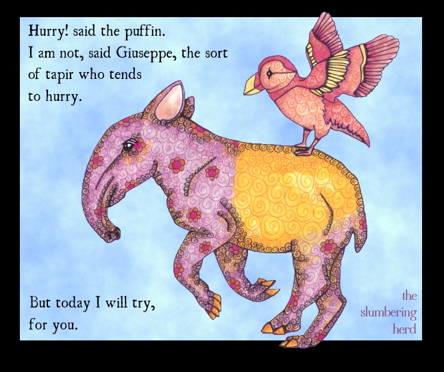
Young Tapir with Puffin in Copic Markers for IF


Young Tapir with Puffin, 9" x 10" Copic Markers with Digital Sky/Text

Yikes! I left town for a few days and totally trainwrecked the vibe of my methodical blogging (twice a week). I finished “Faded” for Illustration Friday at the absolute 11th hour (about 11pm on Thursday!) but did not love it and did not post it.

Here we are at the next week already.  For the topic: Hurry!  At Illustration Friday.

Tuwawi* the puffin has been trying to instill in her friend Giuseppe, a tapir, the importance of being on time to all kinds of engagements. As a long-suffering bird whose husband is the unhurried, moseying type, she thought that starting the tapir young would be a good foundation. Just now they are (sort of) hurrying to an afternoon fruit feast at the home of Guk, a rhinocerus hornbill and great friend of Tuwawi and her husband.

[portfolio_slideshow size=large]


*Tuwawi! means quick! in Inuit. She is from Alaska but unlike the rest of her extended family, neither she nor her husband could stand the cold. After a few months of searching for a suitable home, they ended up in tropical Malaysia of all places. They really liked the bountiful fruits, but it was Giuseppe the baby tapir who sealed the deal. Sometimes two creatures from different worlds just really hit it off. As for Tuwawi’s husband, he tends to socialize mainly with the hornbills (in part due to their naturally unhurried demeanor).

Tapir Running photo reference, Font: Ugly Qua

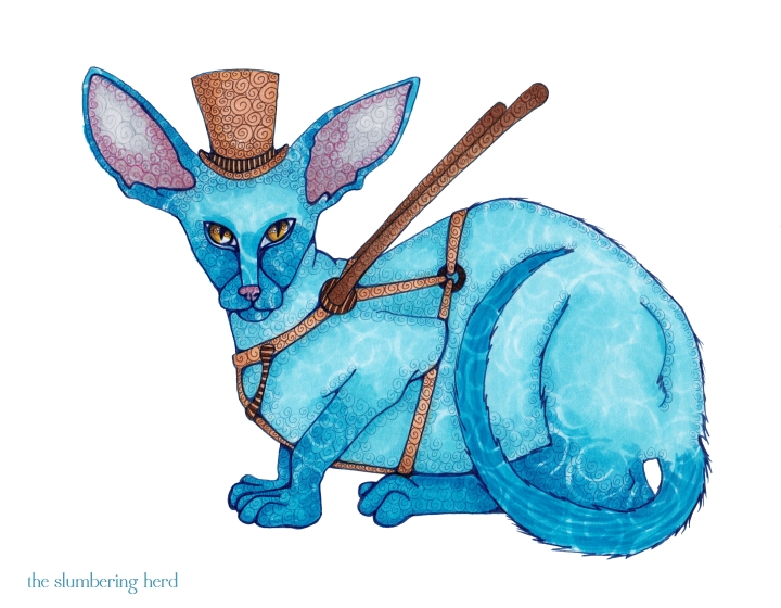
Lars, A Seeing Eye Cat for Illustration Friday

Seeing Eye Cat, 8.5 x 11, Copic Markers

This portrait was found in the attic of an elderly pair of gnome sisters, Margaret and Maybelle, who passed away together at the ages of 76 and 83, asleep in front of the television. The cat, an Oriental Shorthair named Lars, once belonged to their Grandfather Golly, a gift from his daughter (their mother) when his eyes began to fail. The sisters never met Lars but they heard many fantastical tales from their mother, who insisted he was the only seeing-eye cat in seventeen counties.
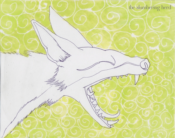
Lars was not particularly great at the job, being a cat. In fact, the harness is likely the result of artistic license as Lars was apparently only convinced to wear it once and with far less aplomb than is on display here. But even without the harness he was very protective of Golly and the two were quite popular about town.

[portfolio_slideshow size=large]

This is my submission to Illustration Friday for the topic “Sight”. In an attempt to go to sleep before midnight I am going to end things here. Please feel free to ask any questions below (or leave comments or chocolates). Thanks so much for visiting!


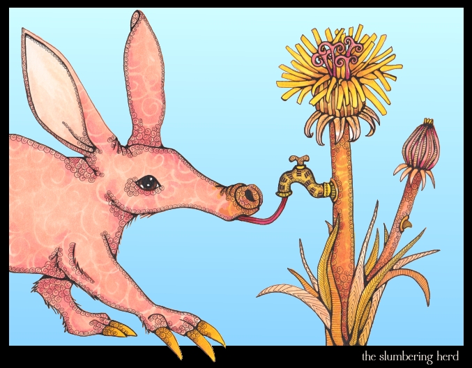
Aardvark and the Dandelion, for Monday Artday

Aardvark & the Dandelion Wine, 8.5 x 11, Copics with digital background

Why the Aardvark Has a Long Tongue.

A very, very long time ago, before humans destroyed the delicate balance of the Earth, there were many astounding biological innovations we can only imagine today.  One such innovator was the dandelion flower which grew its own spigot so that all the creatures of the forest could enjoy its spirited liquids. (Also dandelions were way bigger.)

The aardvark, a curious creature with claws made for digging and ears made for hearing, was one of the dandelion’s most ardent admirers. However, due to his oversized claws, he was unable to manipulate the delicate handles of the spigot. So the Earth did what she did best back then (before corporate “persons” bent her to their will and made her into a grotesque parody of herself). She gave the aardvark a long and agile tongue, well able to bypass the spigot mechanism within and enjoy a bounty of dandelion wine. (The aardvark also used his new tongue to hunt in termite mounds. But that came after, of course.)

This one is starting to look a bit glassy-eyed and might pass out soon. Which is good, otherwise he wouldn’t leave any for the next guy! This illustration was created for the “Drunk” topic at Monday Artday.

And now, a slideshow:

[portfolio_slideshow size=large]

Hooray for sticking with one color family! I did do a bit of extra correction in paint.NET, particularly closing the mouth partly and cleaning up a few messy spots. Most of the ink was done with a teeny 0.05 Copic multiliner, though I did go back at the very end and thicken some lines with a 0.2. Apparently I am on a bit of a kick with long-snouted creatures. This will come as no surprise to those folks who visited during my “big nose” phase which, now that I think of it, may not have been a phase at all.

If you get a moment, take a peek at Topsy-Turvy Trees, the illustration blog of Nei Hatsumi. I know there are a million art blogs out there, but she’s really great but little known, so I thought I would share. I think sharing contributes to a great community. :)

Thanks for stopping in!


Reference aardvark photo from ARKive. Reference dandelion photo from Paul Franklin.

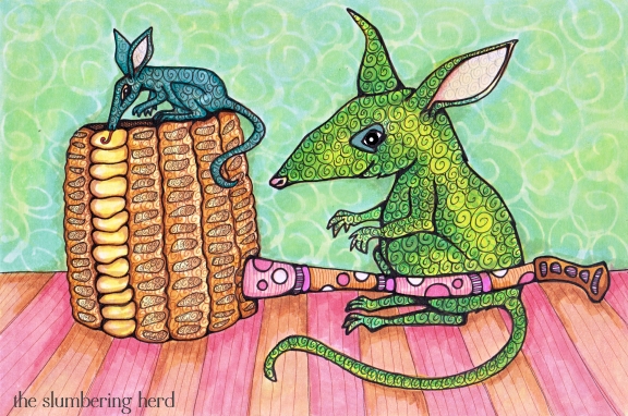
Bilbies and the Corn Cob Pipe, for Illustration Friday

Bilbies and Corn Cob Pipe, Copic Markers, 9" x 6"

In exchange for keeping the cottage free of insects and slugs, Cachimbo* the Corncob Pipe Maker always left a row of fresh kernels on a new pipe as a treat for his friendly rare green bilbies. The mom, an 8-yr old named Daisy, always let the little ones go first. This little one is Jade. Her brother Jasper is napping at the moment after having spent the morning chasing down a spider. (He got it.)

Several missteps with this one. I mean really, a brown and pink pipe stem the same color as the floor? A bilby too close to the color of the wall? Yikes. I always think I know what colors I’m going to use, but then sometimes I get a wild hair and grab something different. Ah, well. My last post is a recent favorite, the Shrew Hare Urn, in case you missed it! (I stuck to my original colors and it worked out just like I hoped.)

Another slideshow with lots of sketches. You will see I tried a few different tacks with the color of the main bilby. I really should have stopped messing with it about step 12 or 13. And a better composition would put the baby facing in toward mom.  Next time! ;)

[portfolio_slideshow size=large]

Not going to bore you with details about the steps (but feel free to ask anything in the comments!) I will add more details for the next one I really like.

Thank you for visiting! You guys are the best.


*Cachimbo means “pipe” in Portuguese (according to an online dictionary).


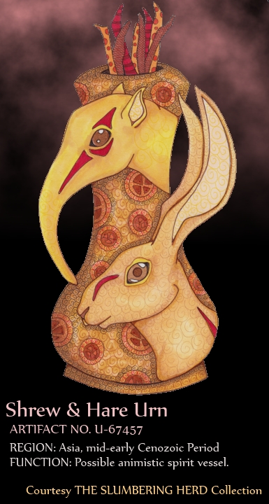
Elephant Shrew Urn Artifact for Monday Artday

Copic Markers and Multiliners, on Canson 150 lb. Fanboy Paper, with digital background and text added at the end.

The topic is Ancient Artifact at Monday Artday. To me that meant: 1. something decorative, and 2. with animals. I wanted to actually limit the color palette (rather than intend to and not do it), and also see if I could avoid my usual thick black outlines. And now, a super neat progress slideshow (my second!):

[portfolio_slideshow size=large]

Row one:  1. Boring urn with fancy handles; 2. a hare (they are cool!), and then something with a long nose for a handle (sort of) – elephant shrew?; 3. better elephant shrew is also GIANT elephant shrew. 4. replace lid with something simple (ugh lots of eraser marks – I really should try to keep a lighter touch). 5. Another different top. Needed stuff coming out. Boyfriend came by to ask why I put a bunch of tiny legs in there! I guess I was thinking sticks. 6. Inked in red ink because I decided to go with  browns and reds.

Row two: 7. Masquepen stage on body of urn; 8. Ooh, golden browns, how I love them. Am I a pro at shading? Not by a long shot, but doing ok. 9. Brown pen outline. I thought about stopping right here. Really! 10. I was worried about adding the red because I was liking just the browns, but I like the way the red contributed. Also went back over the outlines with a very tiny black multiliner – 0.03. 11. Needed some more design on the main part of the urn. 12. Swirly bits – hooray! Adds a bit of depth.

Row three: 13. This is what the actual page looks like, all Copics (and a couple Micron pens). I did a very pale swirl on the rabbit and tried yellow on the shrew but you can barely see it (which is fine). 14. Digital background in vibrant blue, the color I was going to do with Copics (but at the last moment I decided against using all the marker it would have needed); 15. Slightly mysterious (?) black with pinkish clouds. I wanted to do something dark and “serious” and add a kind of museum tag to the bottom. 16. The end!

Thanks to everyone for the insanely nice comments lately. So thrilled people like to look at these things. ;)

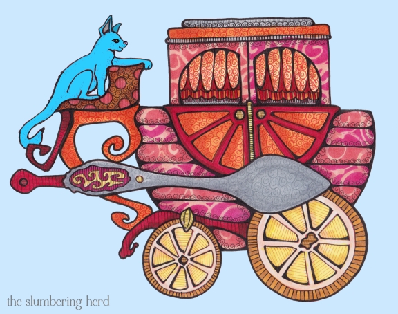
Teacup Carriage for IF Hitched

Teacup Carriage with Blue Cat, Copics with Digital Blues 8" x10"

Teacup carriage with lemon slice wheels, teaspoon axle and tea tin sitting compartment. The cat is a huge Cairo Blue belonging to the owner of the carriage. Her name is Lucy and she is on guard while the owner naps within.

This illustration is entered for the topic Hitched at Illustration Friday. Unfortunately, I was unable to ask the owner to get the carriage hitched up before he went in for his nap, so this will have to do. In any case Diego, the red mule who normally pulls the carriage, is on the far side of the property and in a foul mood this morning.

In other news, I finally got a slideshow widget! It’s called Portfolio Slideshow (for WordPress), from madefromraygun.com. You can hit play or just click through the images. (Would love to know what you think of it-)

[portfolio_slideshow size=large]

Thanks to the very brilliant Richard Ewing at Visual Cogitations, I was recently reminded about the importance of sketching. I started out thinking I would do a carriage-type vehicle in the style of my Cat Ship and Llama Genie Airship, which led to the first sketch, a guinea pig carriage. That didn’t work out but did lead to a teacup-shaped carriage. The third sketch is a small version and the final three sketches show the beginning of the final image.

I decided it needed an animal so perched a cat in the driver’s seat, but I was unhappy with the cat and eventually digitally changed her face and color. The final image in the slideshow shows the carriage with no cat at all because she was getting absolutely bored waiting for me to finish. I like the blue cat so that is the final version at the top of this post.

So tell me if you have a moment, was this post too long and terribly wordy? Did you like the slideshow? Thanks so much for dropping in!

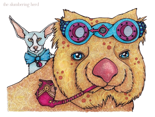
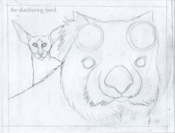
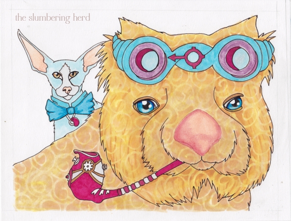
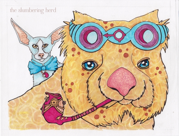
Steampunk Wombat and Cat, Copic Markers

Steampunk Wombat and Peterbald Cat, Copic Markers 8.5 x 11

I wasn’t sure whether to call him Steampunk Wombat or Aviator Wombat. He has asked me repeatedly to simply call him Taz, his given name. (Actually, I wasn’t sure if I should even call him a wombat, since his appearance has strayed somewhat from species norms. But that’s ok.) Along with Taz today is his good friend Hastings, a reserved yet wily cat.

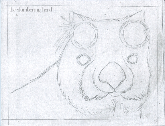
Because my last post’s piece suffered in the sketch stage, I have included some extra sketches. Here goes:

Steampunk Wombat Sketch 1

Mostly wombat shaped. Reference is an un-attributed photo on this page, which must be Australia’s version of the Franklin Mint.

Steampunk Wombat Sketch 2

A much-needed friend (adding interest to the composition, hooray!) Reference is Sir Mauri Vilendor, hailing from a Lithuanian Cattery. (Ah internet, what wonders you still hold!)

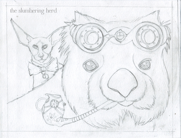
Steampunk Wombat Sketch 3

Now that’s a sketch. I decided against an ocular device obscuring one of the wombat’s eyes, and I didn’t leave enough room for a dandy-ish Victorian scarf or suit, so I went with aviator-ish goggles and a curious yet stylish pipe. Very happy with this sketch, I must say. Slowing down at the sketch phase = good. It also means the sketching takes all of one evening, leaving the rest for a subsequent evening.

Of course it also suggests that taking more days for sketching might be better still, but I must work up my patience slowly.

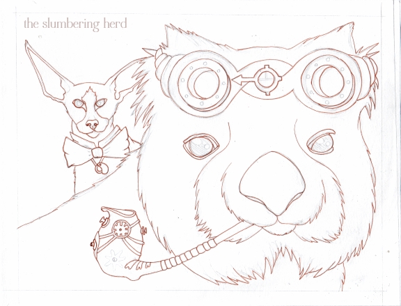
Steampunk Wombat Initial Ink

Recently I’ve been doing an initial ink in a color other than black. They smudge less when erasing pencil lines, for one thing! But they are also somewhat less final.

Steampunk Wombat Masquepen

Steampunk Wombat Color 1

Steampunk Wombat Color 2

Steampunk Wombat Color 3


Steampunk Wombat and Peterbald Cat

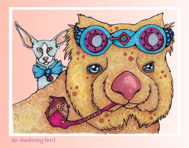
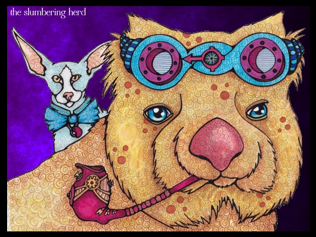
The background is white because I could not decide on a color. Probably peach or something dark. I did some digital backgrounds to test.

Aviator Wombat and Peterbald Cat Peach

Aviator Wombat and Peterbald Cat Purple

Leave it white? Any preference?

Oh also, new banner! Thank you so much for dropping in.


An IF Misfire, and Lessons Learned

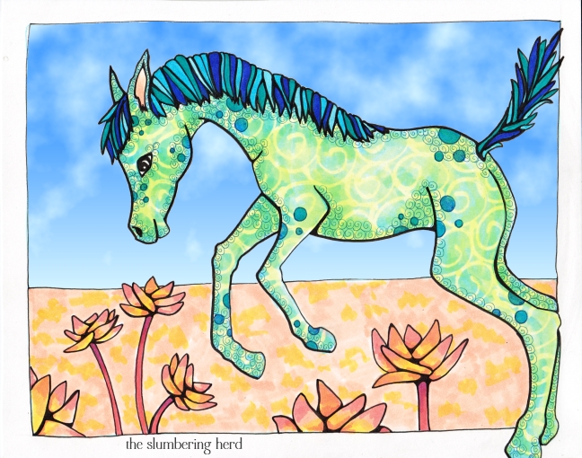
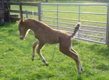
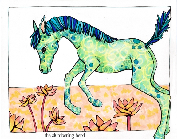
Jumping Colt in Copic Markers with Digital Sky

For a day and a half I was stumped over Jump, the Illustration Friday topic for this week. Things I considered: kangaroo, jerboa, jackrabbit, dog with frisbee, cavorting goat/colt/donkey/alpaca, leaping cat or bighorn sheep, lemmings jumping onto a bouncy castle. Jump starting an airship. Though I am posting this pony, I do not consider it a successful execution of the IF topic.

So why post it? Did I learn some things that might be useful to someone else? I hope so! And I will also say I don’t think it’s all bad, sort of a pony and pattern study. I like the flowers. I am going to post just a few progress pics and talk a bit about where I think I went wrong.

New Forest Pony

This is the extremely adorable photo I finally settled on. It comes from Northern New Forest Ponies of Western Yorkshire. I didn’t have much of a plan beyond drawing him. I thought I would figure out what he was jumping over later. This was a mistake!


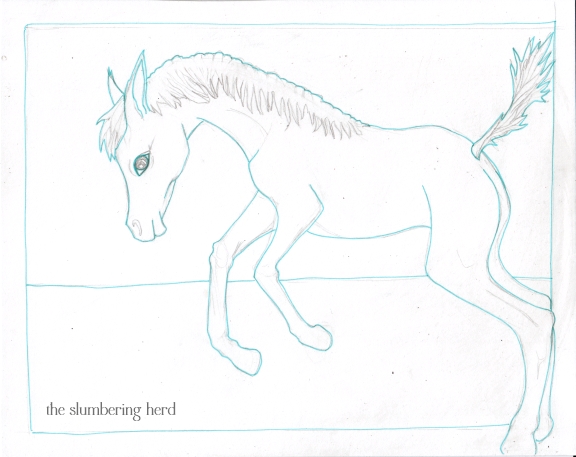
Jumping Colt Ink 1

So here he is, cute enough, but not very interesting for an illustration. I was already inking before I decided what would go in the background (or the foreground, for that matter). And the horizon line was a mistake to include without knowing what else would be added.

I think the lesson of this enterprise is that one cannot expect wonderful things all the time if one does not plan ahead, and for me that means the sketching stage. Sure, sometimes things go GREAT with very little planning, but I suggest this is the exception rather than the rule.

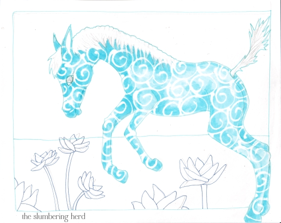
Jumping Colt Masquepen

Flowers were added, but they look a bit like an afterthought because well, they were a bit of an afterthought.

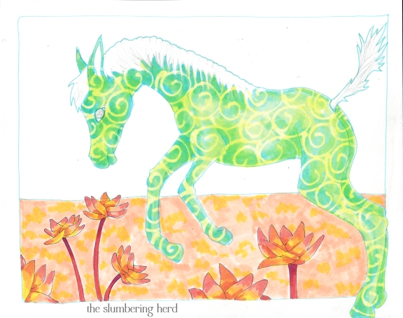
Jumping Colt Color 1

Should have left him blue. Arrgh!

Jumping Colt Copic Markers

Jumping Colt Copic Markers, Digital Sky

I went with a digital sky this time because I didn’t want to spend any more time on it. I may yet add a Copic sky if I put the original in my Etsy shop, otherwise I will move on to the next thing.

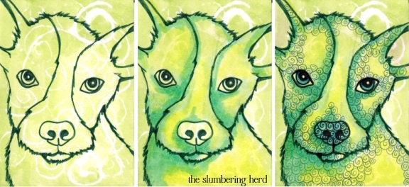
And speaking of the next thing, and because I thought I should add a successful enterprise along with this unsuccessful IF entry, here is a green puppy ACEO (2.5″ x 3.5″ art card), that I also did this week. I must admit I think he is terribly cute. And I think that is a good way to end this post!

Green Puppy ACEO, Copic Markers and Multiliner

Thank you for stopping by! And thanks to everyone for their super nice comments lately, I really appreciate every one!

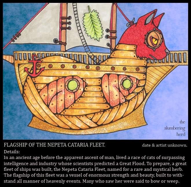
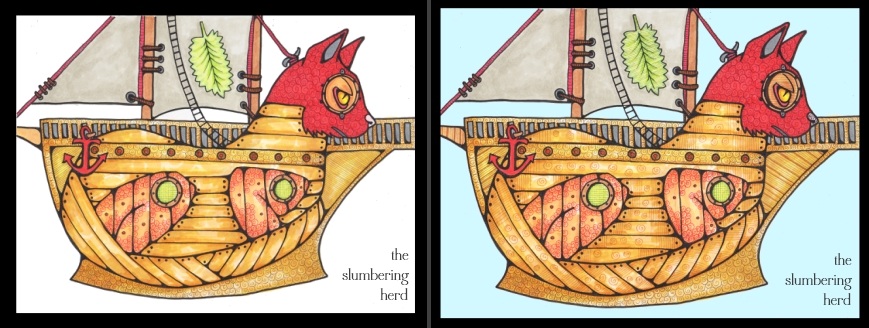
Cat Ship for Monday Artday

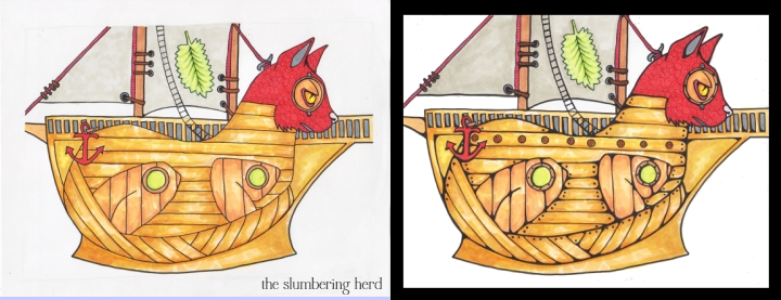
Flagship Nepeta Cataria, Copics with Digital Background

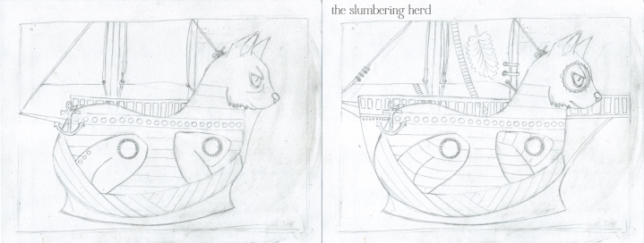
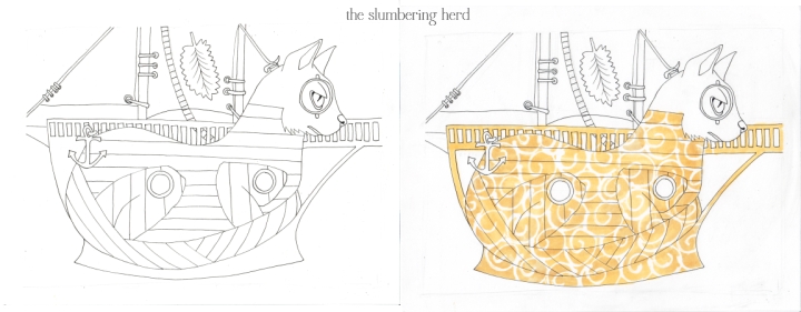
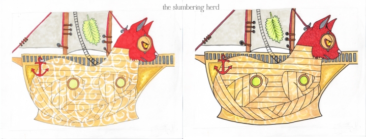
And so it was at Monday Artday that the bi-weekly word was “Flood”. I thought I would do a ship prepared for a flood. And then I started murmuring “cat ship” under my breath. And it sounded like catsup (also ketchup), but I did not care. I was going to put a crew of dogs on the cat ship, but in the end of course it was a cat ship. For cats, man.

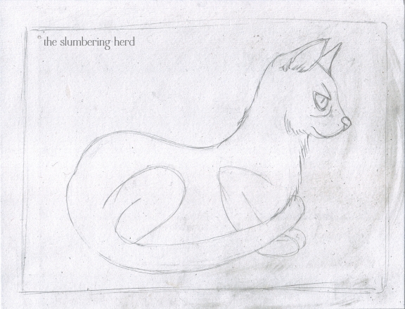
It started with a cat.

Cat Sketch for Cat Ship

I did look at many cat and ship photos, but used no particular photo extensively. Along the way, these happened:

Cat Ship Sketches 2 & 3

Cat Ship Inked, Cat Ship Frisket

Cat Ship Progress, 3 & 4

Cat Ship Progress, 5 & 6

I could have stopped here. I thought about it. I’m not sure I have a handle yet on when to stop adding stuff. I think this is a common problem among artists, even ones much more experienced than me (of which there are many)! This may suggest I need to do some minimalist type beasts. (Perhaps a platypus, as suggested by Gay McKinnon!) Who knows what might happen!

Cat Ship Color, 7 & 8

I messed around with a lot of backgrounds before settling on, uh, more digital clouds. I need a new bag of tricks! Or maybe just one new trick. No, actually I am really pleased with the texture and color of the clouds in the final version. But I am a tad irritated they are digital and not Copic. Alas! I hope you enjoyed your tidbit of ancient cat history. Thank you so much for taking a peek!

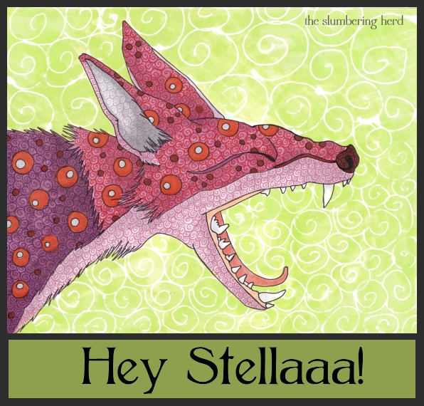
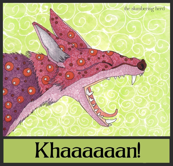
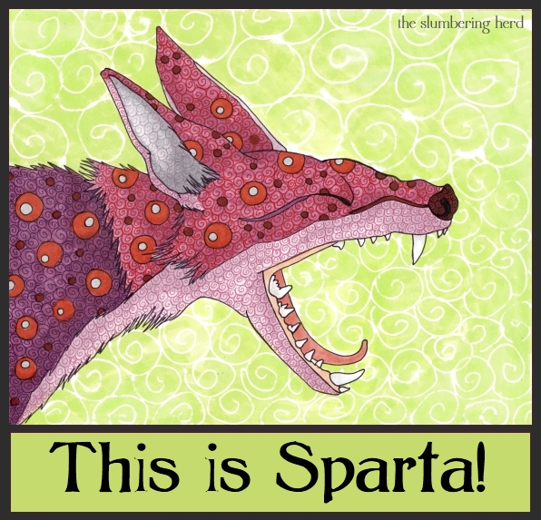
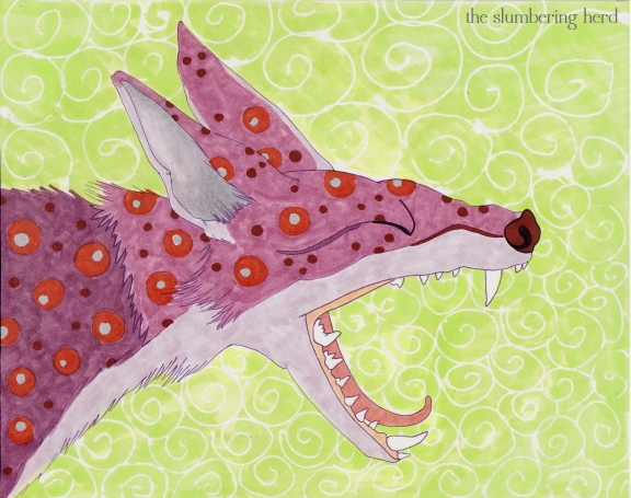
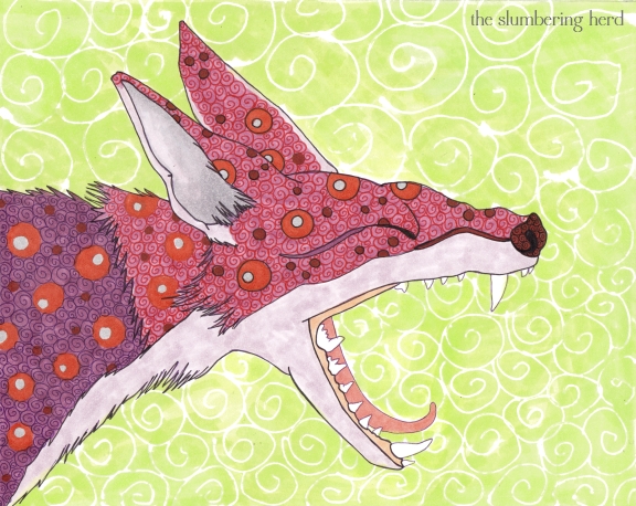
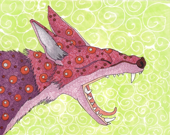
Shouting Fox for “Vocal” at Illustration Friday

Shouting Fox, 8x10 Pen and Ink

Illustration Friday again! Hooray! This week the topic is “Vocal”. A couple more incarnations (in chronological order!):

Fortunately all three of these great quotes include the “AAAAAHHH” that makes it work with the wide open mouth.

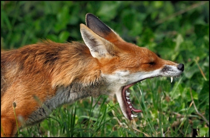
When I read the topic for this week, I thought I would search yawning animal photos for ones that looked like they could be shouting. That led me to this great specimen:

The Ninety Degree Yawn by Andrew Salveson

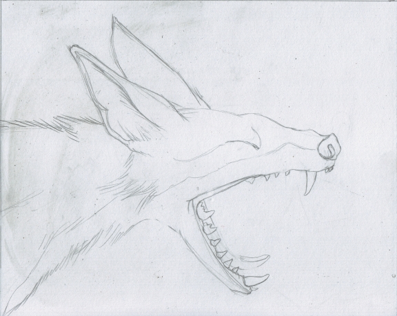
Which led to these:

Shouting Fox Sketch

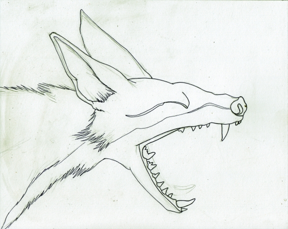
Shouting Fox Ink


Shouting Fox Frisket

Shouting Fox Color 2

Shouting Fox Color 3

Shouting Fox Color 4

I deliberately left a much finer outline than my normal, because I am usually too heavy on the outline. In this case instead of the 3.0 I probably could have gone with a 5.0 multiliner, but I decided to stop here. Of course the frame and text are digital, and the rest is Copic markers, multiliners and Micron fine liners. The font is Bolton Light.

Thank you for stopping in!